Why one team moved back to React from Preact
November 15, 2023 
|
|
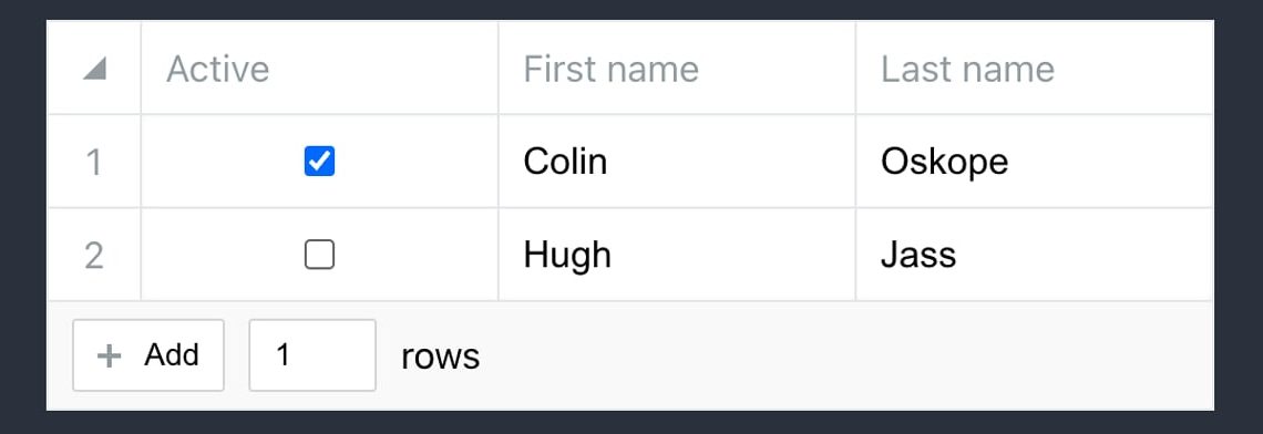
Datasheet Grid: An Airtable-like Grid Component — If you’ve got an array of objects and you want a way for users to manipulate them, this is for you. It’s not going to replace a spreadsheet or an extensive data grid framework, but it’s a good, mature solution for modest use cases and features smooth animations, virtualized rows and columns, keyboard navigation, and more. Nicolas Keller |
|
Moving Back to React (from Preact) — Preact felt like a logical, lightweight choice to this team at one time, but they’ve switched to React for better compatibility with Next.js, among other things. Their page weight is up slightly, but they feel the tradeoff is worth it. Ante Barić (Daily․Dev) |
|
▶ Simplifying Server Components — In a talk given at the recent React Advanced conference, Mark boiled down one of the newest, and perhaps most controversial, React features. A good, straightforward explanation of the parts involved and how they fit together. Mark Dalgleish |
|
QUICK BITS: |
|
My Journey to 3x Faster Builds: Trimming Barrel File Imports — “I maintain a small frontend application (4K LOC) which uses Vite as the compiler. The production build, using npm run build, was taking 26 secs on Github Actions. It seemed awfully slow for such a small application. I decided to investigate why.” Ramana Venkata |
|
▶ Next.js 14: You Missed The Best Part — “Can we turn React components into self-contained Lego blocks that talk to backend services? Let’s find out!” (15 minutes) Jack Herrington |
|
🛠 Code and Tools |

|
|
React Winplaza 98: The Windows 98 Aesthetic for React — Does the fantastic React95 just feel a bit too mid 90s for you? This, based on 98.css, steps forward with an option more reminiscent of the Windows 98/NT 4 era. Does this have any practical use beyond being a nostalgia trip? Who knows, but it makes for a fun screenshot. Lisandro X |
|
|
🌈 Bonus item |

|
|
Indent Rainbow: Make Indentation More Visible with Color — I appreciate if this doesn’t click for you, but I recently discovered this VS Code extension (by way of the GitHub Universe keynotes) that makes indentation levels more obvious through the use of color (either bars, as above, or lines). Hans Raaf |
